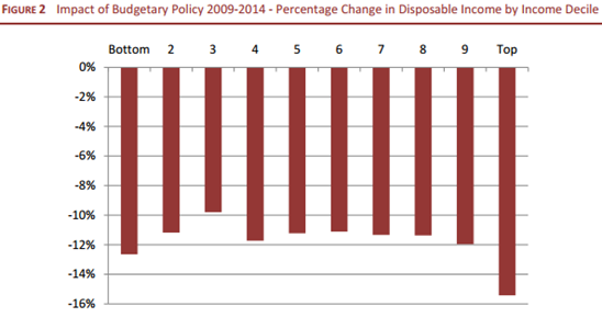
Earlier the week the ESRI published a report that analysed the impact of budgetary policy since October 2008 on household disposable income. It is summarised in this chart.
The commentary on the chart in the report says:
These results do not conform with either a progressive pattern (losses increasing with income) or regressive pattern. (losses declining with income). Over a substantial range (deciles 4 up to and including decile 9 – and also decile 2) the pattern is broadly proportional. But this does not extend to whole income distribution. Contrary to some perceptions of a sharper squeeze on middle income groups, the greatest losses have been at the top of the income distribution, and the next greatest losses at the bottom. Only the third decile had a significantly lower loss (under 10 per cent) than others.
Our focus here is on the final comment. Why did the third decile have a significantly lower loss than the others?
One way to answer this is to look at the composition of households in each decile of equivalised disposable income. This can tell us who is in the third decile. Here is a table that looks at the composition of households by decile in the 2009 SILC. Click to enlarge.
It is pretty clear which households are over-represented in the third decile. Individuals from households with one adult aged over 65 made up 7% of the 12,641 individuals in the households surveyed by the CSO for the 2009 SILC but comprised 22% of individuals in the third income decile. The only other individuals overrepresented in the third decile are those from households with two adults with at least one aged over 65(12% of the sample and 17% of individuals in the third decile).
Combined individuals from these households with adults aged over 65 made up 19% of the sample and 39% of individuals in the third decile.
It should first be noted that the proportions here are those in the survey sample not necessarily those in the population. It is the over/under representation in each decile that provides insight. It should also be noted that the top chart covers changes in disposable income from 2009 to 2014 while the above table of household composition uses data from the 2009 survey only but it is still probably a useful indication of who comprises the protected third decile who have “had a significantly lower loss than others”. Value judgements are left to others.
Tweet


No comments:
Post a Comment